
Best Color Temperature for Outdoor Lighting in Every Area: How to Choose the Right Kelvin for Your Space

Choosing the best color temperature for outdoor lighting starts with understanding how Kelvin values change the way surfaces, plants, and people look after dark. This guide explains color temperature (Kelvin), links it to practical outcomes like ambiance and safety, and gives specific recommendations for landscape, patio, security, and architectural lighting. Many homeowners and designers struggle to reconcile mood, material rendering, and Dark Sky goals while also meeting functional needs; selecting the right Kelvin and complementary parameters such as CRI and lumens resolves that tension. You will learn what warm, natural, and cool whites do visually, which Kelvin ranges work best for trees, flower beds, pathways, facades and security zones, and how 2025 trends like tunable white LEDs and Dark Sky compliance change recommended choices. Each area-specific section contains actionable Kelvin ranges, short design checklists, and a brief note on how professionals implement these choices to achieve predictable, elegant results.
What Is Color Temperature and How Does the Kelvin Scale Affect Outdoor Lighting?
Color temperature (measured in Kelvin) describes a light source's hue from warm amber to crisp blue-white, and it determines perceived mood, contrast, and color fidelity outdoors. Lower Kelvin values (2700K–3000K) feel warm and intimate, while higher values (4000K+) increase apparent brightness and contrast; this mechanism influences how foliage, stone, and skin tones appear at night. Choosing an appropriate Kelvin improves both visual comfort and material accuracy when combined with adequate CRI and correct lumen levels, producing predictable results across landscape and architectural projects. Below, find a concise Kelvin reference and actionable bullet list that helps capture featured-snippet style answers for quick decisions.
A quick Kelvin reference for outdoor use:
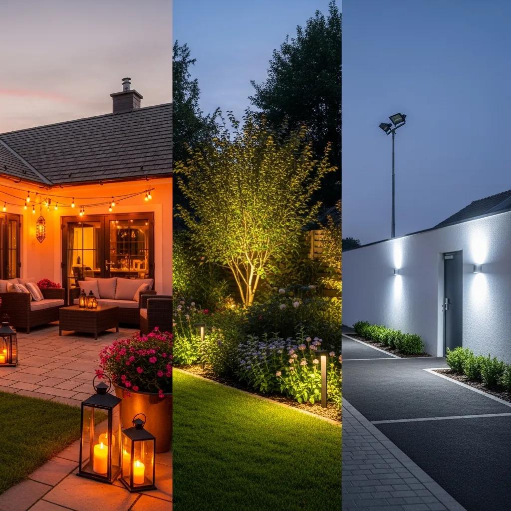
2700K: Warm white — patios, dining, intimate seating for cozy ambiance.
3000K: Soft/natural white — versatile landscapes, garden accents, most facades.
3500K–4000K: Natural to cool white — crisp rendering for textured materials and water features.
4000K+: Cool white — security, high-contrast task areas where clarity matters.
This baseline informs element-level recommendations that follow and connects directly to design choices such as fixture selection and zoning for layered lighting.
What Does Kelvin Mean in Outdoor Lighting?
Kelvin is an absolute unit that maps a light source’s color tone to a numerical scale; lower numbers produce amber and golden hues while higher numbers shift toward neutral or bluish white. The practical mechanism is human color perception: warm Kelvins reduce perceived glare and foster relaxation, whereas cool Kelvins sharpen contrast and improve detail visibility—advantages for security or highlighting texture. Together with Color Rendering Index (CRI) and lumen output, Kelvin determines how accurately colors appear; high CRI paired with an appropriate Kelvin preserves natural plant and material tones after dark. Understanding Kelvin’s perceptual effects helps designers select fixtures and control strategies that balance ambiance and functionality in outdoor spaces.
This concept leads directly to distinguishing warm, natural, and cool whites and their real-world applications in yards, patios, and façades.
How Do Warm White, Natural White, and Cool White Differ in Outdoor Settings?
Warm white (2700K–3000K) reads amber to soft white and tends to enhance skin tones and warm building materials, creating comfortable eating and lounge environments. Natural white (3000K–4000K) strikes a balance between ambiance and clarity, making it the most versatile choice for specimen trees, general landscape washes, and many facade applications where accurate color and a neutral feel matter. Cool white (4000K+) increases contrast and perceived brightness, which benefits security lighting and detailed architectural accents but risks appearing harsh if used indiscriminately near homes or in dark-sky-sensitive areas. When selecting between these bands, designers also consider CRI (aim for 90+ for plant and material fidelity) and lumens to ensure the Kelvin choice supports the intended visual effect without over-illumination.
These distinctions frame specific recommendations for landscape elements and finishing strategies below.
| Kelvin Range | Color Name | Typical Use-case |
|---|---|---|
| 2700K | Warm White | Patios, intimate seating, amber accents |
| 3000K | Soft/Natural White | General landscape, specimen trees, warm facades |
| 3500K–4000K | Neutral to Cool White | Texture highlighting, water features, facades needing clarity |
| 4000K+ | Cool White | Security zones, high-contrast task lighting |
What Is the Best Color Temperature for Landscape Lighting?

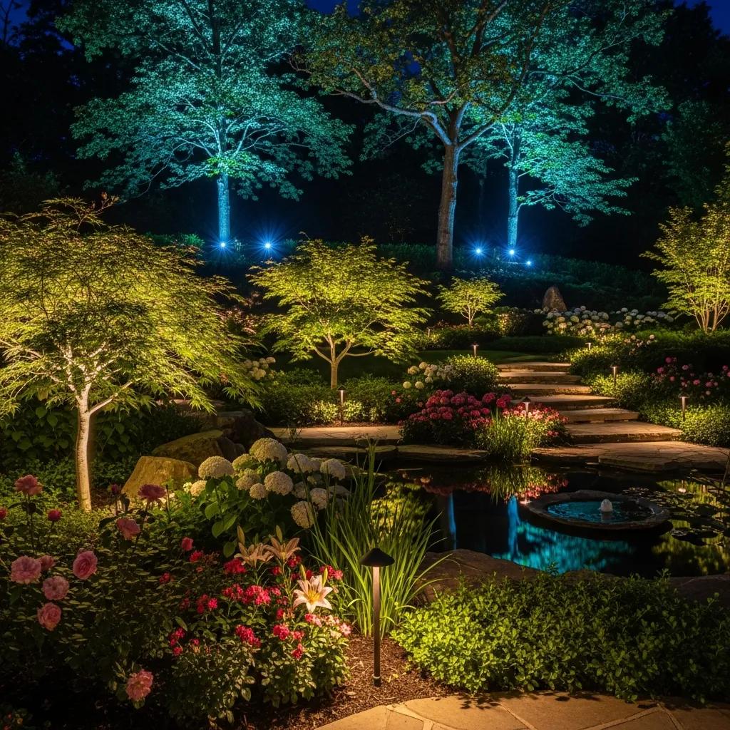
Landscape lighting benefits from a nuanced Kelvin approach because plants, bark, and flowers respond differently to tone and intensity; the right temperature enhances depth, texture, and seasonal color. For specimen trees and shrubs, designers commonly choose 3000K to enrich greens while avoiding the yellow cast of lower Kelvins; pairing that with CRI 90+ preserves subtle leaf variation. Flower beds often benefit from slightly warmer values (2700K–3500K) to render petals with warmth and saturation, while moonlighting techniques that mimic moonlight use cooler neutrals (3500K–4000K) for convincing overhead washes. Layered lighting—combining grazing, uplighting, and low-level path illumination—relies on consistent Kelvin selection to avoid mixed color clashes and to maintain a cohesive night-time palette.
Landscape lighting checklist and quick design tips:
Choose 3000K for general planting areas and specimen trees to balance color fidelity and ambiance.
Use 2700K–3000K for intimate seating adjacent to beds to create warmth without muting plant color.
Reserve 3500K–4000K for moonlighting and textured feature highlights where crisp contrast is desired.
These recommendations translate into predictable outcomes when fixtures, beam angles, and CRI are coordinated; the next paragraph explains practical implementation for specific landscape elements.
How Does Color Temperature Enhance Trees, Shrubs, and Garden Features?
Specimen trees often gain dimensionality and richer green tones at 3000K, where the hue deepens contrast between leaves and negative space while avoiding the cool sterility of higher Kelvin values. Shrubs and textural groundcovers respond similarly but can tolerate slightly warmer settings if situated near seating areas, which reinforces a cohesive garden-to-living transition. Bark and trunk textures are best emphasized with narrow-beam uplights at neutral Kelvins (3000K–3500K) to create sculptural depth that reads well from multiple sightlines. Always pair these Kelvin choices with high CRI sources and appropriate lumen control to maintain plant health perceptions and to prevent washout under stronger fixtures.
Which Kelvin Ranges Are Ideal for Flower Beds and Moonlighting Effects?
Flower beds typically benefit from 2700K–3500K depending on species and desired warmth—warmer Kelvins increase perceived saturation in reds and oranges, while neutral Kelvins preserve subtle pastel hues. For moonlighting—fixtures mounted high in tree canopies to simulate natural moon glow—designers often choose 3500K–4000K and use narrow-beam, well-aimed fixtures to mimic low-angle celestial light without harsh hotspots. Placement and angle matter: hang or mount fixtures 10–15 feet above the ground for gentle shadowing on paths and features, and use dimming to adjust mood for seasonal or event-based scenes. Thoughtful Kelvin pairing with beam control delivers believable, directional moonlight that enhances depth and safety simultaneously.
Professionals use visualization to confirm these choices in situ and to fine-tune Kelvin before installation; the following note explains how service providers implement recommended ranges.
Understanding the nuances of color and light is fundamental to achieving desired visual effects, as explored in the foundational principles of light and color theory.
Light and Color Theory: Understanding Color Temperature and CRI for Ambiance Section 2.2 investigates color temperature, determining whether light appears warm or cool, which is vital for creating desired atmospheres in interior spaces. Section 2.3 discusses the Color Rendering Index (CRI) and its role in evaluating how accurately a light source renders colors, influencing the perception of objects. Sections 2.4 through 2.6 delve into the intricacies of color theory. Hue, saturation, and brightness (Sect. 2.4) represent the core attributes of color, while contrast (Sect. 2.5) explores the relationship between light and dark, fundamental for emphasizing design elements. Color psychology (Sect. 2.6) uncovers the emotional and psychological responses elicited by different colors, enabling the creation of spaces that evoke specific feelings and moods. Light and color theory, G Ozenen, 2023
Blingle! applies visualization technology and custom LED options to show clients how 2700K–3500K selections will render their plants and features at night, helping avoid surprises and ensuring installed lighting matches design intent.
| Landscape Element | Recommended Kelvin | CRI Preference |
|---|---|---|
| Specimen trees | 3000K | 90+ |
| Flower beds | 2700K–3500K | 80–90+ |
| Water features | 3500K–4000K | 90+ |
How to Choose the Right Color Temperature for Patio and Entertainment Areas?

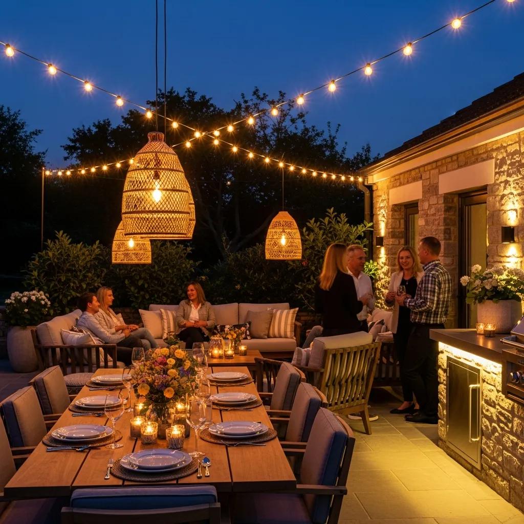
Patio and entertainment areas prioritize social comfort and visual warmth, so warm white tones in the 2700K–3000K band are typically the best starting point for dining and lounge zones. Warm Kelvins enhance skin tones, encourage relaxation, and increase perceived intimacy—important psychological effects that support hospitality and outdoor living. Layered lighting strategies—combining warm decorative pendants, soft wall washes, and adjustable task lights—let spaces shift between dining, casual lounging, and cleaned-up task modes without changing fixtures. Dimming, tunable white options, and integrated control scenes further allow hosts to tailor Kelvin and intensity for different occasions while maintaining consistent color harmony across zones.
Patio lighting design advice in list form:
Start with 2700K–3000K for general ambience and dining comfort.
Add local task lighting at slightly higher Kelvins only where needed, keeping most fixtures warm to preserve cohesion.
Use dimming and scenes to transition between dinner, cocktails, and post-party cleanup.
These tactics create flexible outdoor rooms that read as comfortable and intentional; designers should prototype scenes with visualization tools before committing to final fixture specs.
Why Is Warm White Recommended for Dining and Lounge Spaces?
Warm white (2700K–3000K) is recommended because it mirrors the color cues people associate with hospitality—soft amber light improves appetite perception and social comfort while masking minor blemishes in fabrics and surfaces. The underlying reason is human circadian and aesthetic response: lower Kelvin reduces blue content, which signals evening to the visual system and supports relaxation. Practical implementation pairs warm Kelvins with dimming and layered fixtures: overhead pendants for table definition, wall or step low-lights for navigation, and accent spots for planters or art. Selecting bulbs and fixture color temperatures together prevents mismatched tones that can break the immersive feel of an outdoor living room.
How Does Color Temperature Influence Outdoor Relaxation and Socializing?
Color temperature influences how welcoming a space feels and can encourage longer stays and more relaxed interactions; warmer tones foster intimacy, while cooler tones promote alertness and brisk activity. For multi-use patios, tunable white systems enable rapid scene changes—lower Kelvins for dinners, slightly higher for games or tasks—without changing fixtures. Smart controls let hosts program schedules that shift Kelvin throughout an evening, preserving both mood and safety. Combining consistent Kelvin planning with appropriate lumens and beam control ensures guests experience seamless transitions rather than jarring color shifts.
Professional installers often demonstrate these scenes using visualization tools so clients can experience Kelvin-driven mood changes before installation, reducing revisions and ensuring satisfaction.
Blingle! implements warm-white patio scenes using custom LED fixtures and visualization demos to help homeowners preview dining and lounge atmospheres prior to installation.
What Color Temperature Works Best for Security and Pathway Lighting?
Security and pathway lighting prioritize visibility, contrast, and safe navigation; this often pushes recommendations toward neutral-to-cool whites for high-contrast detection and object recognition. For active security zones where crisp detail matters, 4000K is commonly recommended because it increases perceived brightness and color separation without extreme blue spikes. Pathways and steps benefit from slightly warmer neutrals—3000K–4000K—to balance safety with comfort and avoid creating glare or disorienting color casts. Critical trade-offs include avoiding over-illumination that causes glare or light trespass and using well-shielded fixtures and correct aiming to meet Dark Sky principles while preserving sightlines.
Key safety checklist for pathway and step lighting:
Use 3000K–4000K for pathways and steps to maintain comfortable visibility.
Aim fixtures downward and shield to prevent glare and spillage into neighbors’ properties.
Specify lumen ranges appropriate to spacing (moderate lumens with close spacing or lower lumens with denser fixtures).
These measures create safer night-time circulation without sacrificing neighborhood Dark Sky considerations; the next sections explain why cool whites help security yet require mitigation measures.
Why Are Cool White Lights Ideal for Security Zones?
Cool white lights (4000K+) deliver higher contrast and enhanced edge definition, improving recognition of faces, objects, and potential hazards—key for security monitoring and surveillance system performance. The mechanism is increased short-wavelength content that heightens visual acuity at night, making scene details easier to discern from cameras and the human eye. However, cooler Kelvins can feel harsh and contribute to light pollution if not properly shielded; designers offset these effects by specifying cutoff fixtures, zoning, and motion-activated or dimmable controls to reduce constant glare. Balancing visibility and nuisance lighting protects both safety objectives and neighbor relations while supporting Dark Sky-friendly installations.
The pervasive issue of light pollution, exacerbated by urbanization, has significant ecological and practical consequences, impacting everything from wildlife to astronomical observation.
Color Temperature and Outdoor Lighting: Combating Light Pollution ABSTRACT: Due to urbanization, amplifying the artificial illumination gets to unwanted & unintended places. Especially the light predisposed towards skyline categorized as light pollution. Light pollution has proved catastrophic for ecosystem. Light pollution obfuscates skydome, leads to a surge in the energy utilization, interferes with astronomical investigation, perturbing ecosystems, and consequently health and well-being of mankind & nature. Light pollution augmenting the levels of carbon emission in the environment. Astronomical investigators have marked negative impacts on the ecosystem, Color Temperature and Outdoor Lighting, I Ashdown, 2015
How Should Pathways and Steps Be Lit for Safety Using Color Temperature?
For steps and pathways, choose 3000K–4000K and combine with low-mounted, shielded fixtures spaced to eliminate deep shadows and trip hazards while maintaining comfortable contrasts. Lumen guidance depends on spacing and fixture type, but aim for lower lumen outputs focused and shielded to avoid blinding pedestrians; use warmer Kelvins when lines of sight are close to seating or facades. Proper beam angles (narrow to medium) and placement near tread edges reduce shadowing and improve depth perception, and adding consistent spacing of fixtures prevents sudden light/dark transitions. Finally, include a simple commissioning pass after installation to fine-tune aiming and dim levels for real-world use.
Professionals commonly apply these specifications during design and install phases to ensure pathways meet both safety and Dark Sky expectations.
| Fixture Type | Recommended Kelvin | Lumens Range | Shielding/Note |
|---|---|---|---|
| Path bollards | 3000K | 50–300 lm | Use downward light and diffusers |
| Step lights | 3000K–3500K | 50–200 lm | Recessed or riser-mounted, aim to avoid glare |
| Flood/security lights | 4000K+ | 800–3000 lm | Use shielded housings, motion/dimming controls |
Blingle! installs pathway and security lighting systems that match these Kelvin and shielding recommendations, using design plans that document aiming, lumen counts, and zoning for predictable safety outcomes.
How Does Color Temperature Affect Architectural and Facade Lighting?
Architectural lighting hinges on matching Kelvin to material palettes: warm materials like brick and wood typically read better at 2700K–3000K, which accentuates inherent warmth and texture, while cool materials such as concrete, steel, and glass can handle 3500K–4000K to reveal surface detail and crisp edges. The mechanism at play is color harmony—Kelvin alters perceived hue and contrast, so selecting a complementary temperature preserves design intent rather than masking or altering material appearance. Using tunable white or zone-controlled systems lets designers vary Kelvin across elevations to emphasize warm focal points while keeping overall facade clarity. Fixture selection (narrow beams for detail, wide washes for planes) and CRI are equally important to avoid color shifts and ensure faithful material rendering at night.
What Kelvin Ranges Highlight Warm vs. Cool Building Materials?
Warm-toned materials such as brick and natural wood look richest at 2700K–3000K because the lower Kelvin emphasizes red and orange undertones and reduces contrast harshness. Neutral materials like stucco and painted surfaces usually perform well at 3000K–3500K, which keeps colors accurate while offering moderate perceptual brightness. Cool-toned materials—metal cladding, concrete, and glass—benefit from 3500K–4000K to highlight edges and texture without creating an overly clinical appearance. Choosing the correct Kelvin range prevents false color shifts under night lighting and supports cohesive streetscape presentations when multiple materials coexist on a single facade.
How Can Color Temperature Accentuate Architectural Details?
Use Kelvin strategically with beam angle and mounting height: narrow-beam 3000K uplights reveal cornice details without over-washing adjacent planes, while wide flood 3500K washes can emphasize large surfaces and create graduated depth. Combining temperatures—warm for ornamental trim and slightly cooler for larger planes—creates visual hierarchy and dramatic depth, especially when controlled by zoning or tunable white systems. Pay attention to color rendering (CRI 90+ for accurate finishes) and use shields and precise aiming to avoid unintended color mixing that blunts texture. Trial visualizations and on-site mockups confirm how selected Kelvins interact across elevations and with surrounding landscape lighting.
Expert installers coordinate these choices in the design phase to ensure the final installation accentuates intended architectural features while meeting maintenance and energy goals.
Blingle! works with clients to specify Kelvin ranges matched to building materials and offers visualization-driven mockups so facades are tuned before fixtures are installed.
| Material | Recommended Kelvin | Design Tip |
|---|---|---|
| Brick/wood | 2700K–3000K | Accent trims and warm facades with narrow beams |
| Stucco/paint | 3000K–3500K | Use medium washes to preserve color fidelity |
| Metal/concrete | 3500K–4000K | Employ higher Kelvins with crisp grazing to reveal texture |
What Are the Latest 2025 Trends and Technologies in Outdoor Lighting Color Temperature?
In 2025, the industry continues shifting toward warmer, human-centered nightscapes (2700K–3000K) that balance ambiance with ecological considerations, while tunable white LEDs and smart controls allow single installations to cover multiple use-cases without changing hardware. Dark Sky compliance and shielding remain central drivers, encouraging designers to choose lower Kelvins and precise aiming to reduce blue light scatter and ecological disruption. Integrated, energy-efficient LED fixtures with high CRI are now standard, enabling better material rendering at lower power consumption; coupled with scene-based controls, these systems deliver both economy and design flexibility. Visualization technology and pre-install mockups increasingly reduce iteration by demonstrating Kelvin-driven outcomes before physical work begins, streamlining approvals and client satisfaction.
A short list of practical trend implications:
Prioritize 2700K–3000K for human-centric lighting and Dark Sky alignment.
Use tunable white systems to support multi-use outdoor spaces without visual compromise.
Specify high-CRI, energy-efficient LEDs and include shielding to limit light pollution.
These trends mean designers can create richer, more sustainable night environments while allowing owners to shift scenes with simple controls; the following subsections tie Dark Sky and smart tech to concrete recommendations.
How Do Dark Sky Compliance and Eco-Friendly LEDs Influence Color Temperature Choices?
Dark Sky guidance encourages lower Kelvins and fully shielded fixtures to reduce skyglow and ecological impacts, making 3000K or lower the preferred choice for many residential and public installations. The reasoning is that warmer light contains less short-wavelength blue content that scatters more easily in the atmosphere, so selecting 2700K–3000K with cutoff fixtures minimizes upward light and supports nocturnal wildlife. Eco-friendly LEDs also reduce energy use and often include integrated optical control, which helps designers meet both sustainability goals and aesthetic targets. Implementing these choices requires coordination of fixture selection, aiming, and control strategies to balance visibility with environmental stewardship.
What Role Do Smart Lighting and Tunable White LEDs Play in Custom Outdoor Lighting?
Smart lighting and tunable white LEDs let owners adapt Kelvin and intensity for different activities—dinner, security, or landscape highlighting—without multiple fixture types, minimizing visual clutter and installation complexity. The practical benefit is flexibility: schedule-driven Kelvins can automatically shift from warmer evening scenes to cooler, higher-contrast security scenes when needed, while occupancy sensors reduce baseline light levels. Integration requires upfront design that considers zones, control protocols, and user interfaces so scene transitions feel intuitive and preserve consistent material appearance. Visualization during design and post-install commissioning verifies that programmed Kelvin scenes perform as intended in real-world conditions.
Tunable scenes: Allow owners to change Kelvin for social, security, and maintenance modes.
Dark Sky-aware defaults: Use 2700K–3000K as evening baseline with shields to minimize skyglow.
Visualization and commissioning: Confirm scenes and aim before final sign-off.
These steps help translate 2025 trends into installations that are both beautiful and responsible.
Blingle! is a premier outdoor lighting service provider offering custom LED outdoor lighting solutions, visualization technology to preview Kelvin choices, world-class service, a worry-free guarantee, and energy-efficient luxury fixtures. For homeowners and commercial clients seeking predictable outcomes, Blingle! provides visualization demos and expert installation that implement the Kelvin ranges and design strategies outlined in this guide.
What Blingle! provides: Design, visualization, installation, and maintenance tailored to landscape, patio, security, and architectural lighting objectives.
Value proposition: Visualization-driven design reduces surprises; customized Kelvin selection and high-CRI LED products produce accurate material and plant rendering while supporting Dark Sky and energy goals.
These service capabilities help close the loop between technical recommendations and installed results, ensuring Kelvin choices translate into the intended night-time appearance.
Frequently Asked Questions
What are the benefits of using tunable white LEDs in outdoor lighting?
Tunable white LEDs offer flexibility in outdoor lighting by allowing users to adjust the color temperature according to different activities or times of day. This adaptability can enhance ambiance for social gatherings with warmer tones while providing cooler, brighter light for security purposes. Additionally, these systems can help reduce energy consumption by automatically adjusting light levels based on occupancy or time schedules, making them an eco-friendly choice that aligns with modern design trends and Dark Sky compliance.
How can I ensure my outdoor lighting complies with Dark Sky regulations?
To comply with Dark Sky regulations, focus on using fixtures that are fully shielded to prevent light pollution and minimize upward light scatter. Opt for warmer color temperatures, typically 2700K to 3000K, as they contain less blue light, which is more likely to contribute to skyglow. Additionally, consider using motion sensors and timers to control lighting levels and reduce unnecessary illumination during off-peak hours, ensuring that your outdoor lighting is both effective and environmentally responsible.
What role does the Color Rendering Index (CRI) play in outdoor lighting?
The Color Rendering Index (CRI) measures how accurately a light source displays colors compared to natural light. In outdoor lighting, a high CRI (90+) is essential for accurately rendering the colors of plants, materials, and architectural features. This is particularly important in landscape and facade lighting, where the goal is to enhance the visual appeal and maintain the integrity of colors at night. Choosing fixtures with a high CRI ensures that your outdoor spaces look vibrant and true to life after dark.
How can I create a cohesive lighting design across different outdoor areas?
To achieve a cohesive lighting design, maintain consistent color temperatures across different outdoor areas while considering their specific functions. For example, use warm whites (2700K–3000K) in dining and lounge areas for comfort, while opting for cooler whites (3000K–4000K) in pathways and security zones for visibility. Additionally, employ similar fixture styles and materials throughout the space to create a unified aesthetic. Layering different types of lighting—ambient, task, and accent—can also enhance the overall design while ensuring functionality.
What are the best practices for lighting pathways and steps safely?
For safe pathway and step lighting, use fixtures with a color temperature of 3000K–4000K to provide comfortable visibility without harsh glare. Install low-mounted, shielded fixtures to minimize shadows and ensure even illumination along walking surfaces. Proper spacing is crucial; fixtures should be placed close enough to eliminate dark spots while avoiding over-illumination. Additionally, consider using dimmable lights or motion sensors to adjust brightness based on activity, enhancing safety while maintaining a welcoming atmosphere.
How does color temperature affect the perception of outdoor spaces?
Color temperature significantly influences how outdoor spaces are perceived. Warmer tones (2700K–3000K) create a cozy and inviting atmosphere, ideal for social settings like patios and dining areas. In contrast, cooler tones (4000K+) enhance visibility and detail, making them suitable for security and task-oriented spaces. The right color temperature can also affect mood; warmer lights promote relaxation, while cooler lights can energize and alert. Therefore, selecting appropriate color temperatures for different areas is essential for achieving the desired ambiance and functionality.
Conclusion
Choosing the right color temperature for outdoor lighting enhances the visual appeal and functionality of your spaces, ensuring safety and ambiance. By understanding the nuances of Kelvin values, you can create inviting environments that cater to both aesthetic and practical needs. Explore our expert services to find the perfect lighting solutions tailored to your outdoor areas. Illuminate your home beautifully and responsibly with our premium lighting options today.