Light, Art, and the Plaza: How Color Temperature Sets a Mood
Kansas City does two things exceptionally well: make art feel local and make lighting feel magical. Every September, the Country Club Plaza Art Fair turns storefronts into galleries and sidewalks into critique circles. Meanwhile, the Spanish Revival rooftops and those famous Plaza lights remind us that a city can be curated the way a museum is—one warm bulb at a time.
This week we’re borrowing a page from the Plaza playbook to talk about the single most powerful (and most misunderstood) choice you can make with exterior lighting: color temperature. We’ll keep it practical, a little nerdy, and very KC.
The 60-Second Primer: CCT vs. CRI (Hold the Jargon)
CCT (Correlated Color Temperature) tells you the color of “white” light on the Kelvin (K) scale.
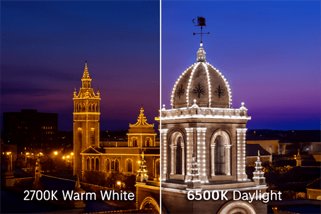
- 2700K – Warm white (think candlelight/incandescent).
- 4000K – Neutral white (balanced, bright without being blue).
- 6500K – Daylight/cool white (bluish, like an overcast noon sky).
CRI (Color Rendering Index) tells you how well the light reveals colors. It’s scored from 0–100. Higher is better. CRI 80 is fine; CRI 90+ makes stone, brick, paint, and plantings look the way they do in your head.
Cheat line: CCT is the vibe. CRI is the truth.
Why 2700K Loves Stone and Brick (and Your House Loves 2700K)
The Plaza’s glow is warm on purpose. Warm white (around 2700K–3000K):
- Flattens harshness: Warm tones soften mortar lines and unite mixed materials—especially KC brick and limestone.
- Enhances texture: Grazing a facade with warm light emphasizes relief without washing it out, the way gallery lighting draws attention to brushstrokes.
- Plays nice with landscaping: Greenery looks rich instead of neon.
- Photographs beautifully: Warm light at “blue hour” is Instagram’s favorite marriage.
If your home leans Spanish Revival, Tudor, Craftsman, or mid-century brick, 2700K is almost always the best baseline. It reads “Plaza classic” instead of “mall parking lot.”
Where 4000K Makes Sense
4000K is the neutral white of the design world. It’s bright and crisp without the blue tint of 6500K. Use it sparingly and intentionally:
- Modern details: Steel, glass, black windows, smooth stucco—4000K can look sharp and architectural.
- Task zones: Steps, address plates, side yards, and work areas where visibility matters more than mood.
- Accent contrast: A 4000K “slice” on a steel awning or house numbers against a 2700K facade gives you gallery-style hierarchy: one focal point, not a light fight.
Rule of thumb: If it’s a place for seeing (house numbers, steps), 4000K is your friend. If it’s a place for looking (façade, garden), let 2700K take the lead.
The Trouble with 6500K on a House (and When It’s Okay)
6500K (daylight) has a time and place: garages, shop benches, camera-heavy security zones, and photo/video tasks. On residential facades, though, it often reads as harsh:
- Blue cast can make brick look cold and mortar chalky.
- High contrast emphasizes imperfections you never noticed at noon.
- Neighbor relations suffer if cool light throws glare across property lines.
If you love the “bright white” look, compromise: front elevation 2700K, address and steps 4000K, garage task light 5000–6500K with shielding. Your house stays inviting and your projects stay visible.
A Plaza-Inspired Lighting Plan (Works on Every House)
1. Choose your base:
- 2700K–3000K warm white as the architectural wash.
- CRI 90+ if you can get it.
2. Add two accents:
- 4000K tight beam on the address/entry hardware.
- 2700K graze on brick or stone to bring texture forward.
3. Restrain the roofline:
- Keep nodes/dots dimmer than the wall wash for a premium look.
- Aim outward/down, not up (goodbye skyglow).
4. Dim by time:
- Sunset to 9:30 p.m.: 70%
- 9:30–11 p.m.: 40%
- After 11 p.m.: either 20% warm marker lights or off (your HOA will send you a fruit basket).
5. Add a “Plaza Mode”:
- Warm white base with micro-accents of amber (every 6th node).
- Save it as your Art Fair and holiday shopping scene.
Side-by-Side: What You’ll See
Split-screen test (try this on your phone mockup or lighting app):
- Left side 2700K: brick looks deeper, limestone golden, landscaping velvety.
- Right side 6500K: brick skews orange-pink, mortar pops brighter than intended, shrubs look bluish.
Run the same experiment with 4000K. You’ll likely keep 2700K for the wash and 4000K only where you need crisp legibility (numbers, steps, mailbox).
A Quick CCT & CRI Decoder (because menus are confusing)
- “Warm White,” 2700–3000K: Cozy, flattering, Plaza-classic.
- “Neutral/Cool White,” 3500–4500K: Clean and modern—great for numbers and steel.
- “Daylight,” 5000–6500K: Task-bright; handle with care on facades.
- CRI 80 vs 90+: Both work: 90+ makes red brick and oil-rubbed bronze hardware pop accurately. If you’ve ever bought paint that looked different at night, you’ve met low CRI.
Translation:
CCT = the mood of the party. CRI = whether everyone looks good in the photos.
Plaza History, Mini-Edition
The Country Club Plaza opened in 1923 as the nation’s first suburban shopping district designed for cars. Its familiar Spanish architecture—arched windows, tile roofs, stucco—was chosen precisely because it looks gorgeous in warm light. The signature Plaza lights, strung each winter since 1925 (with a wartime pause), set the template for how Kansas City thinks about evening color: soft, golden, communal.
Design note: the Plaza’s iconic warmth isn’t an accident; it’s a philosophy. Human-scale light, warm tone, no glare. Apply that philosophy to your house and it will read distinctly KC.
Avoiding the Two Big Mistakes
1. Too cool, too bright
- 6500K at 100% everywhere turns your facade into a stadium. If your goal is Plaza, not parking lot, start warm and dim.
2. Texture flattening
- Pointing a wide, bright beam straight at brick can bleach detail. Grazing (light skimming along the surface from below) makes relief and mortar lines sing—especially with 2700K.
A Simple, Repeatable Setup (Copy/Paste)
- Zones: “Wall Wash,” “Roofline,” “Address/Steps,” “Landscape Front,” “Porch.”
- Scenes:
- Plaza Warm: 2700K wall wash 65%, roofline 45%, landscape 55%.
- Gallery Night: Wall 60% 2700K; address/steps 4000K 55%; roofline off.
- After-Hours: 2700K porch 25%, path 20%, everything else off.
- Schedules:
- Daily sunset → 10:00 p.m. (Plaza Warm)
- 10:00 p.m. → 11:00 p.m. (After-Hours)
- Friday override for Red Friday… because we’re still KC.
Troubleshooting: “Why does my brick look orange?”
- Check brightness first. Over-bright warm light can feel orange; dim to 60–70%.
- Verify CRI. A low-CRI “warm white” often exaggerates oranges. Move to CRI 90+.
- Balance with neutral accents (4000K on numbers/metal) to keep the overall palette grounded.
A Quick KC Give-Back
If you’re out at the Art Fair, consider stopping by or donating to a local arts nonprofit—ArtsKC, KC Young Audiences, or a neighborhood gallery collective. Kansas City’s warmth isn’t just lighting; it’s how we fund the stage behind it.
Subtle Sales Nudge (Plaza Edition)
We can help you test drive scenes on your home—2700K wall wash, 4000K number pin spot, gentle roofline dimming—and set the schedules so the look is yours every night without a single toggle. It’s like having a lighting curator for your curb.